Traffic is an hands-on map based system that allows people to know when construction, roadblocks, and traffic occurs in local or city areas through live updates, notifications, and visual charts. Drivers and truckers can locate when and where construction or other inconvenient road disturbances may occur through the updates of construction workers who would also use the app.
The entire design is based on developing a sense of transparency with both drivers/truckers and roadworkers in order to foster an improved relationship between either party while on the road.
What Problem Are We Trying To Solve?
Drivers often face challenges navigating construction, roadblocks, and detours without clear information, leading to difficulty planning routes amid traffic disruptions. Construction workers, in turn, may face risks and scrutiny due to drivers' frustrations and a lack of transparency about their projects.
Personally experiencing frustration while continuously detouring due to roadblocks and traffic inspired me to address the inconsistency between construction and drivers, driving me to develop a solution for more of a connection between the two.
What’s The Solution?
To address these challenges, I decided to develop a mobile app with real-time tracking of roadblocks, construction, and detours. Users can plan alternative routes, while truckers optimize paths to avoid car-only roads. Construction workers use the app to update project details, improving planning and aiding in traffic avoidance. The app focuses on enhancing convenience and planning for users.
Key goals include:
● Developing a strategy for efficient travel through construction areas.
● Improving communication between construction workers and drivers.
● Creating a tracking system to help users avoid ongoing projects.
Research: Exploring Where to Start!
Assumptions In General Research:
Initially, I envisioned creating a simple tracking and logging system for drivers, but soon recognized the project's broader scope. I needed to address universal design flow questions:
Competitive Analysis: What Are Some Comparisons Of My Ideas?
In researching similar concepts, I identified a few companies operating on a more general or smaller scale than anticipated, providing a basis for comparison. Despite each prioritizing a better driving experience and informing users about traffic and roadwork, their unique approaches provided insights into potential directions for my overarching design.
One On One User Interviews
Expanding on insights from the competitive analysis, I identified the necessity for additional information to shape a practical design for my app. Subsequently, I conducted user interviews with five individuals to gain diverse perspectives. The questions centered on understanding their interactions with traffic while driving and how an app, similar to my vision, could benefit both drivers/truckers and construction workers on the road.
“Sometimes when I got on the road I suddenly found myself in traffic due to emergency construction occurring, and its frustrating to deal with it since it just happened.”
“I want to know the second fastest alternate route that can get me to my destination and also know how long it will take to get around the traffic.”
The responses I received were diverse, providing multiple perspectives on how individuals approach driving and handle traffic in different conditions. Despite the variations, I identified common themes in their answers, allowing me to categorize their ideas effectively. These themes include: Driving and Frustrations with Traffic, User Needs, Communication with Construction Workers, How a Traffic App Could Function, and Tools used for Detours & Construction.
You can view the affinity map in further detail here:
These replies gave me a much needed perspective in understanding how I would need to produce the screens and elements of the app, as well as how the user’s needs must be met through its interactivity and design flow.
Key Takeaways
Based on the interviews, several key considerations emerged for the next steps of my design:
User Personas: Who Would Be Using This App?
Leveraging the affinity map and insights from interviews, I pinpointed the key users for my app and categorized their traits to create user personas. These personas, encompassing a driver, a trucker, and a construction worker, form the central focus for tailoring the app's design to meet their specific needs.
How Might We: What Questions Should I Be Asking?
With the aid of the interviews and user persona, I realized I had to further comprehend the direction of where I wanted to go with the general user interface and experience with the app, hence I created HMW (or how might we?) statements which would both address any issues I had in terms of design and aid in the user flow of my production.
Feature Roadmap: What Features Should I Include?
Recognizing the project's scope, I acknowledged the need for a diverse range of features to define the design's articulate nature. Drawing insights from interviews and research, I identified essential features such as a map, destination setting, security notifications, and rerouting capabilities. To enhance user appeal and ensure accessibility for first-time users, I structured these features akin to a traditional map system, while also incorporating advanced functionalities like truck routes and construction timelines.
Sitemap & User Flows: Creating The Backbone Of My Design!
I faced a challenge in crafting the sitemap and user flow for my app due to the expanding scale of the project. To address this, I utilized the desired features to establish the design's backbone, starting with a central home screen. Gradually, I built each section based on how users would interact with the app and its features, resulting in the physical design of Traffic. The user flow also reflects this decision with each of the given ‘tasks’ a user would do with the app, and follows the design mentality that I utilized with the sitemap.
Sitemap
User Flows
Concept Design & Low-Fidelity Wire Frames: What Do We Do With These Flows?
I developed early sketches and wireframes for my app, focusing on a map-centric approach inspired by competitive designs. The simple and clean design includes features like live notifications, a calendar for construction schedules, and a map highlighting construction, roadblocks, and traffic. Additional screens cater to construction workers, enabling them to post dates and create projects, showcasing the app's full range of features.
A key challenge in creating low-fidelity designs was ensuring a modern and slick feel, requiring exploration for a concept that felt both professional and appealing. To address this, I utilized references and studied other apps to infuse freshness and interest into the design. This phase taught me the importance of understanding how a modern design should function in terms of both UX and UI, emphasizing the necessity of proper spacing and effective information presentation for a seamless app flow.
My original design had icons on the bottom, as well as two buttons above them for alerts and destinations. The general search, map and top icons were present however for the overall design.
This version of the low fidelity design improved the general structure. Added tags for types of traffic, and adjusted the alert button. App icons were also removed and placed in the top right ‘more’ button.
Low-Fidelity Wire Frames
Here are some other screens from my production. The trick with each of these screen was to give a sense of visual variety while also being connected together through both the menu, the map, and the pop-up like nature of the design in a similar notion to other map-based systems/apps.
Mood Board: Bringing The Design Elements Together!
We Need A Logo For This App!
My next task was to design a logo for the app and establish a distinctive visual identity that encapsulated the essence and intention of both the user flow and the general project design. I aimed for a construction/road work-oriented theme that was simple yet conveyed a sense of purpose and style. After considering several names, 'Traffic' emerged as a fitting choice, capturing the attitude and concept I wanted to convey with the logo. The name stuck after completing the initial sketches seen below.
In the design process I wanted to utilize a simple color palette, so I selected orange and blue for their complementary and distinct qualities. This color combination conveyed a sense of safety and importance, and thus the logo and style of ‘Traffic’ was born.
Envisioning A Style-Guide & UI Kit
My next course of action was to bring these design elements (the colors, text, and imagery) together and convey the overall style that I was looking to develop with the app. I wanted to develop a brand personality that was clean but also represented a sense of safety, transparency, and convenience (as listed below). I figured a style guide and UI kit would follow a simplistic set of design principles while also being both easy to view and use on the road.
Style Guide
UI Kit
High-Fidelity Designs, Testing, and Iterations
With the UI kit, I began developing the first version of my Traffic app. The design prioritized high-quality standards for a streamlined interface, aiming to guide users efficiently with minimal screens. The goal was to convey friendliness while delivering desired features. The initial design flows below include the first screen, a driver's menu, a typical directional map, a calendar for construction notifications, a map of trucking roads, an overview of roadblocks and construction, an info box for construction details, an add project feature for workers, and an add construction feature for instant project creation.
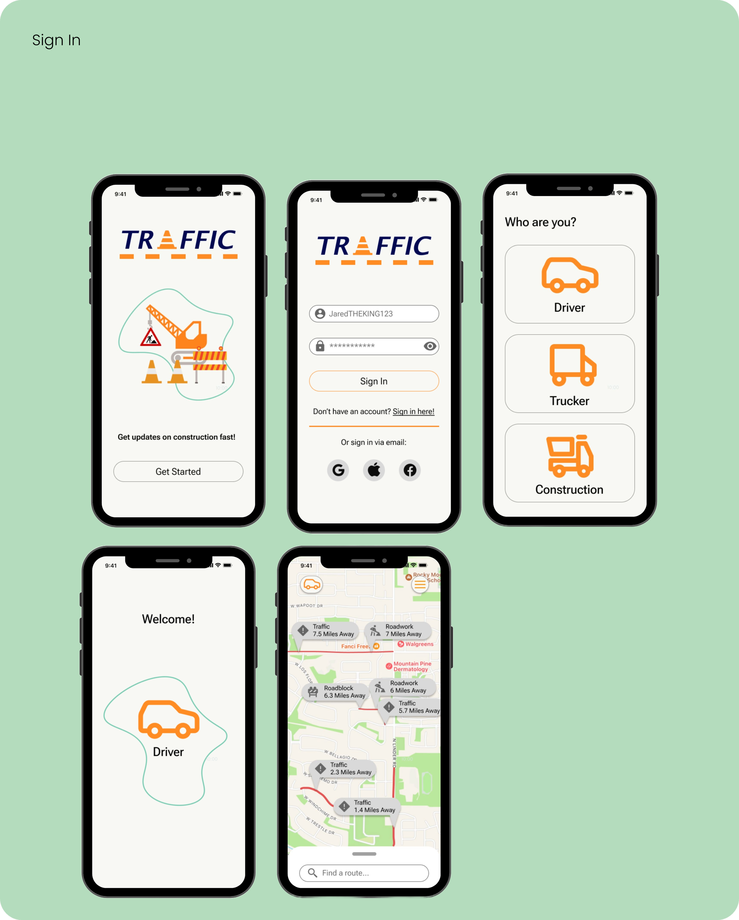
Here are the initial set of screens involving the sign in, user identification, and home screen. In this first version of the high-fidelities, I made sure the design had a sense of space and organization so the user could transition cleanly into the aforementioned home screen, and I also included a greeting screen to give said user a sense of welcomeness and engagement with the app.
Here are the initial high-fidelity screens for trucker routes and a calendar highlighting construction dates for drivers and truckers. In this iteration, I focused on demonstrating the availability of the trucking routes feature, with the calendar functioning similarly to a standard calendar while also alerting users about construction dates and their time schedules in specific areas. The designs were made to be simplistic while also user friendly and easy to understand.
Here is a showcase of the high-fidelity screens for the map, directional, alerts, and main menu. These features could help a user know where traffic, construction, and road blocks occur while also using a directional to avoid said traffic. Originally, I had wanted to include a section on the bottom of these screens that would display buttons about the calendar, routes, and alerts, but I realized that would diminish the app’s flow of design, so I moved the buttons into the hamburger menu in the top right for users to access easily.
Here are the initial high-fidelity screens for the construction section. These screens highlight a construction worker's capabilities, including posting projects, updating statuses, adding projects to the map, and creating notices for drivers about road construction changes. Aligned with my design principles of simplicity and organization, each screen prioritizes user flow and space, facilitating easy navigation and providing a sense of control. The aim is to enable construction workers to quickly grasp the design's functionality while offering a valuable service to their users.
Testing My Assumptions Via Interviews!
The high-fidelity screen designs were tested in a real-world setting with five knowledgeable interviewees. Tasks involved signing in, using features, and exploring navigation options for various user groups. Participants also performed actions like entering notices and updating roadwork details.
My research goals aimed to understand user navigation, inner design workings, and provide a user-friendly experience. Success metrics included ease of exploration, minimal pain points, and clear differentiation between app sections for users, ensuring visual and UX design cues guided them effectively.
Once testing concluded, I compared my notes of each of the replies and funneled it into simple data, This data would help evaluate my design and aid in learning where I would need to make adjustments:
I identified patterns in user feedback for each app section:
Useability Testing Results
Suggestions for Improvement:
● Apply minor UI/spacing updates for a mature appearance.
● Transfer construction design aspects to the driver/trucker sections for additional context.
● Add an extra screen for the truck road section.
● Enhance UX components for construction with a modernist look.
● Adjust colors for more visual appeal and improved design focus.
With the recommendations and feedback I had received from the interviews, the next step was to follow through with these changes and update each and every screen in order to finalize the design.
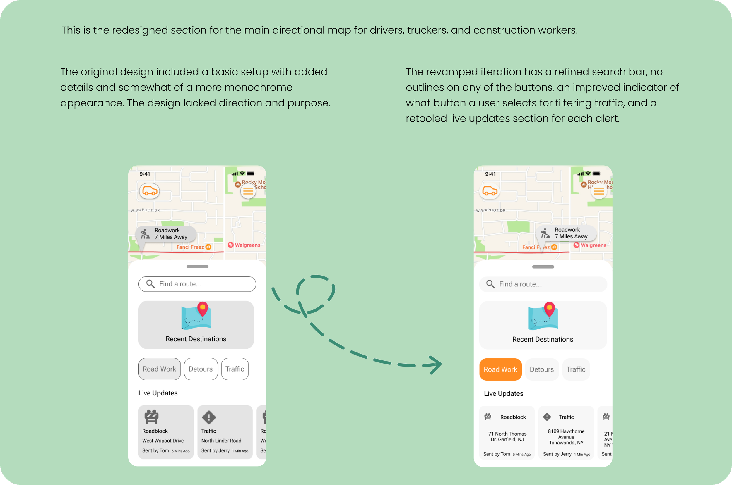
Below are a few examples of some of the changes I applied to each of my screens.
Iterations And Revisions
Putting It All Together
Final High Fidelity Wireframe Prototype
After a number of hours fine-tuning the design and applying various updates, I was able to compete the overall app and finalized it through connecting each screen with wireframes and making the entire design playable and available to test.
Conclusion & Reflection
Traffic was designed to help various road users bypass traffic, construction, and roadblocks efficiently, saving time. The app supports both construction workers and drivers through a mutually beneficial service, enhancing transparency and safety on the road. I aimed for a formal yet fun design, fostering connections among users. Through this process, I learned the importance of giving your best in every project, emphasizing that understanding user wants and needs is crucial for successful design in both UX/UI and life overall. The app reflects this understanding.
Next Steps
My next steps involve fine-tuning the design, addressing pain points to maintain professionalism and a consistent user-friendly UX/UI. Specifically:
● Apply additional updates to enhance visual efficiency and address any issues with the screens.
● Continue running tests and interviews for feedback, making improvements based on responses.
● Develop a handoff for potential developers, enabling them to implement updates and features for improved design efficiency and the app's full realization.


