Craft is a skill-based learning application that gives people the opportunity to learn and further develop on art-based skills from various different backgrounds in a simplistic manner. Users can explore different skills, learn various lessons about a certain art topic, post their work to the social media network within the application, and discuss topics/ask questions with other people/teachers in order to expand their knowledge of a subject.
What Problem Are We Trying To Solve?
In the digital age, distractions and obligations hinder skill development, especially for those managing jobs, school, and other commitments. Social media alone consumes 2.5 hours daily, totaling 864 hours yearly. Amid this dynamic world, individuals deserve time for rest and artistic pursuits, but busy lives often impede such aspirations.
The Solution:
People seek ways to develop art-based skills or acquire new knowledge while balancing these pursuits with modern life. Learning and staying proactive amid numerous resources can be challenging. The project aimed to address these issues by developing a product that simplifies resource discovery and promotes user-friendly design.
Central goals included:
● Understanding how people seek information for art-based skills.
● How they consistently return to learning methods.
● How they plan and manage skill acquisition.
● How the project aims to uncover motivations for learning art and design and guide individuals toward their goals despite busy daily lives.
Research: Let’s Start Solving This Problem!
Assumptions in General Research:
In the project's initial concept, I assumed people would be interested in developing art skills when presented with accessible tools to learn at their own pace. However, as I planned the implementation, I had somewhat of a revelation:
Competitive Analysis: What Companies May Be Similar To My App Idea?
To develop my ideas and concepts, I compared existing companies and their business models, particularly those focused on aiding individuals in developing various skills, especially in art. These companies offered online tutorials, lessons, and video resources tailored to users' preferences. Reviewing their approaches provided valuable insights for shaping my own project design.
Let’s Develop A Perspective Through User Interviews!
In order to find a direction to develop this design, I held a total of 8 interviews with individuals that were of ages 22 to 68, and asked them questions I created that focused on time management, skills/hobbies, the interface of a design, and the means to gain new information. Some of these questions include:
Each of their comments had similarities that were then combined into six categories that included User Needs, Experiences With Art, Functionalities of Art, Visual Aspects of an Art Application, How Information is Presented to Users, and Learning Skills and Motivations. I then compiled these categories into an affinity map in order to properly organize each section of information.
You can view the affinity map in further detail below:
Key Takeaways: What I Learned From These Interviews
Based on the interviews, several conclusions and commonalities emerged:
“Art could be used as a way to better the self, as creating a piece cements the learning process. Doing is the biggest part of the learning process.”
“The idea that you can make something interesting is great. I want to inspire people to also make their own cool work. There’s self satisfaction in all that, so if you want you can do something in a filed, then you can do it for real. You must learn from failure in order to succeed for that however, but it’s worth it.”
User Personas: Who Would Be Using This App?
From these results, I developed user personas for my design that focused on users who would need a resource to either learn from or further study with as a tool. These perspectives would guide my design and overall creation of the product.
How Might We…? What Questions Should I Be Asking To Further Articulate My Design?
With the user personas established, I created HMW (How Might We) statements, which I developed in order to understand the perspective of how I should ideate and explore my overall design flow.
The point of these questions is to find solutions to people’s problems and extrapolate on them via the overall design of the project itself.
Site map & User Flow: Creating The Backbone And Concept For My Design!
From Concept To Sketches To Low-Fidelities!
One of the problems I faced when developing this design was figuring out how I should create a feasible yet effective user flow since the design would require a lot of planning and articulate detail in order to function properly. Below are the sketches I developed in order to combat these issues, which I found the answer to through creating screens that were simple yet effective in conveying their points and bringing users to their directed interests as quickly as possible.
Low-Fidelities
I aimed to create a seamless wireframe design across the app, emphasizing purpose through visuals and aesthetics. My central goal was to provide user control and easy navigation, prioritizing a user-friendly flow. The focus was on crafting a simple yet intuitive design for a welcoming and easy-to-use product. The showcased design represents my early thought process for Craft, specifically the lesson section, allowing users to find, choose, and learn lessons at their own pace, utilizing a calendar feature for planning and tracking lessons.
Another central challenge that I faced when it came to designing Craft was developing a version that could be utilized on a desktop, but modified to still have an aesthetic to that of a mobile screen (but just on a laptop). I was unsure at first of how to go about modeling the design in a way that was still user friendly and had a decent sense of flow to the design, but thanks to multiple references and understanding the general dynamics of design, I managed to create early versions of what would later become the second part to Craft.
Style Guide: Creating The Look And Feel Of The App!
Developing a unique brand for Craft was a central challenge, as aiming for a concise and interesting design was essential. Since the app's purpose was to serve as a learning tool for users of all ages, I decided on both a bold and playful color palette, and the text type Roboto Flex to visually attract and assist users in navigating the app.
The reasoning behind the color pallet choice was due to the general focus of complementary colors and the fact that they were easy on the eyes in terms of overall clarity. The final brand, named 'Craft,' was selected to evoke an open and inviting feeling, fostering engagement and creativity.
High-Fidelity Designs, Testing, and Iterations
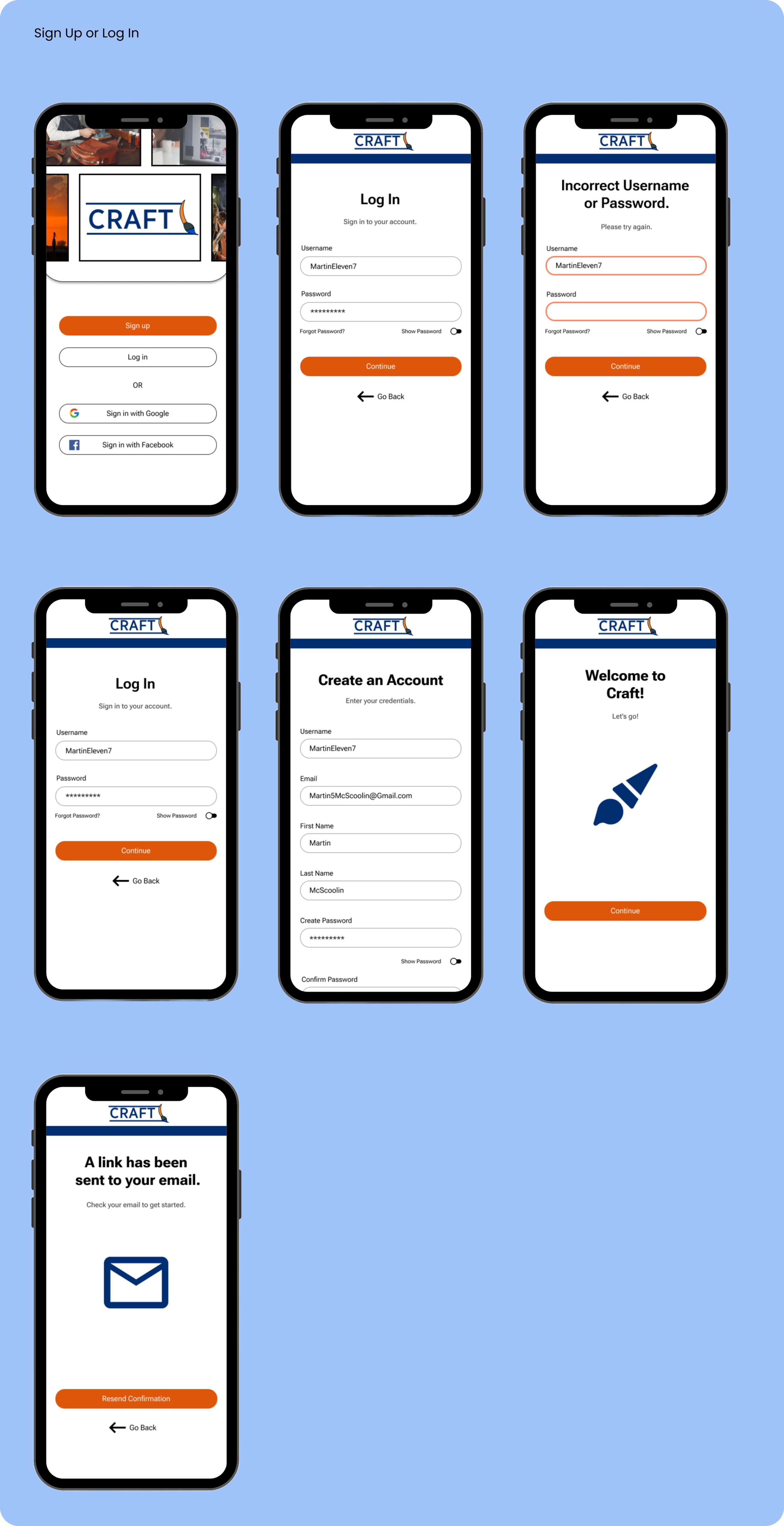
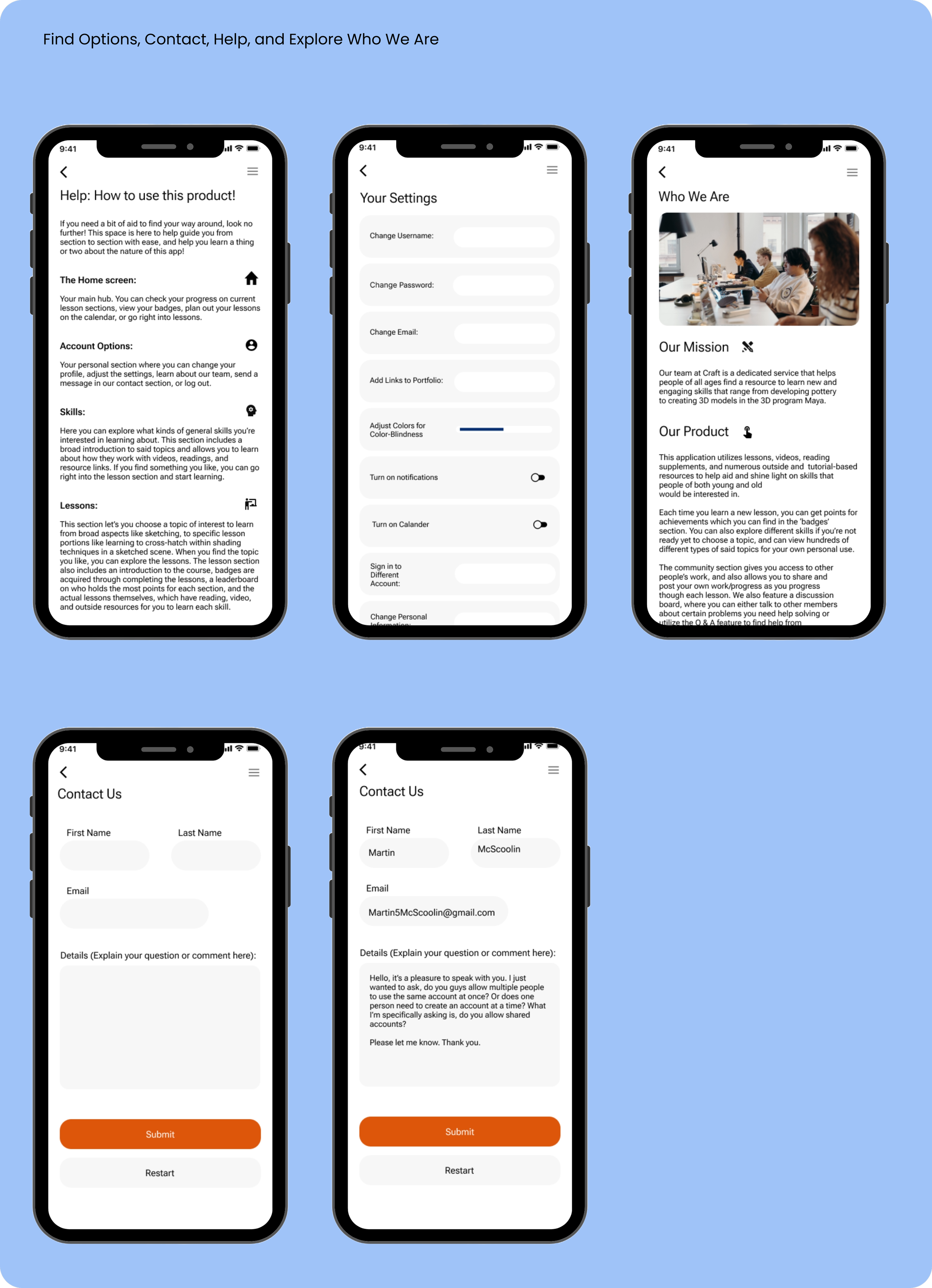
Finalizing the Craft app design involved integrating textures, fonts, and images from the component library into the low/mid-fidelity wireframes, while maintaining a user-friendly approach for all ages. The design, inspired by Instagram, emphasizes simplicity in colors and layout, particularly in a screen series enabling users to post and share their art through the app's social networking system.
Let’s Test The Design And See What Everyone Says!
After developing and prototyping the design, I tested its functionality, focusing on fine-tuning and enhancing the user flow. The sections tested included sign-in, explore, lesson, account, and community.
Key objectives included assessing login ease, navigating to lessons, posting, exploring skills, and using discussion boards. Research goals encompassed examining user experience, identifying issues, ensuring task completion ease, and understanding layout comprehension without vocal guidance.
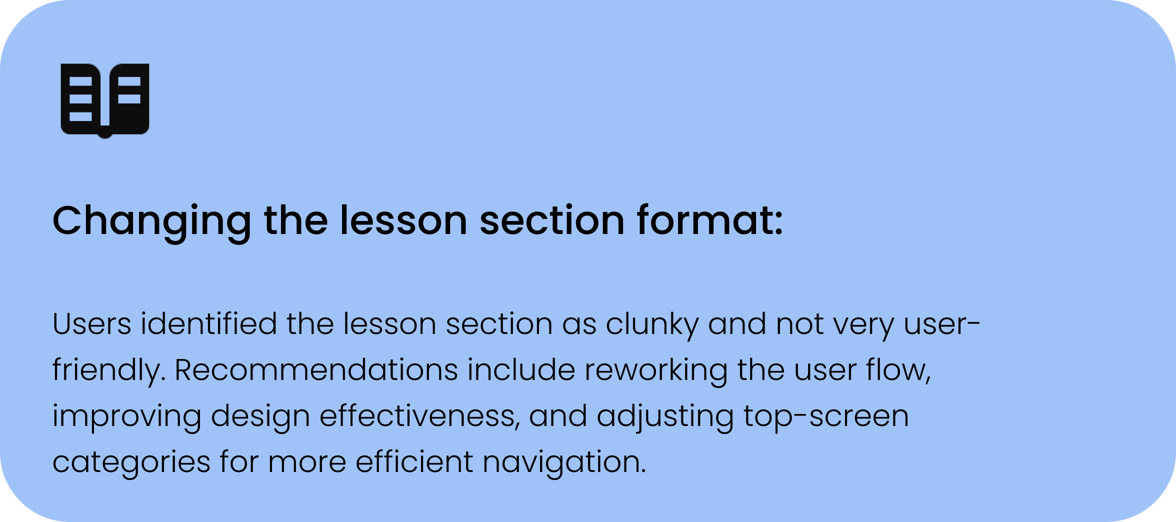
Post-testing, I received valuable feedback from participants, highlighting positive responses to the sign-in, explore, and lesson sections. However, improvements were needed, this included:
So with that, I went back to work to figure out a better method of design.
Revised Iterations: Back To The Drawing Board
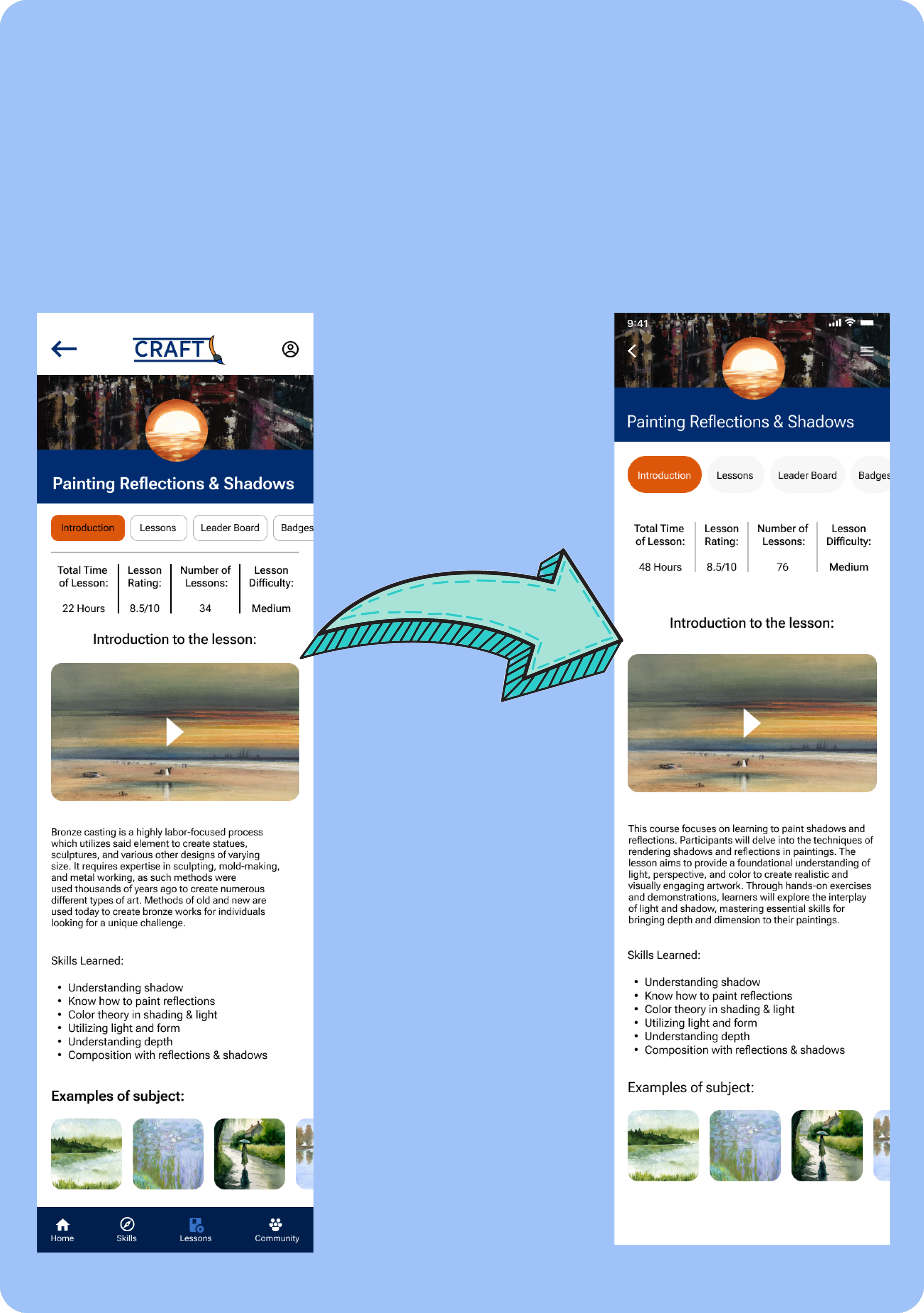
Given the feedback, I devised a plan to enhance design flow and user-friendliness, particularly addressing concerns in the lesson and community sections that displayed excessive screens. To rectify this, I consolidated multiple screens in both sections into an organized menu. For instance, in the lesson section, users can now choose to explore the course introduction, access direct lessons, view the leaderboard, or check their badges, streamlining the user experience. Note: Some initial screens are missing due to technical issues.
This screen showcases a redeveloped design that would be the first view of the lesson section that a person would see when they first select the section feature in the menu.
This screen included simple, small button selection tags with outlines around them, as well a a blue divider and less of a general focus on the ‘Find Top Lessons’ section and more on the topics below it. The search bar also has an outline around it and is thinner in nature.
This redesigned screen now has both the buttons and search bar recreated to have the outlines removed and their spaces darkened, while the ‘Find Top Lessons’ section further utilizes the capabilities of the Iphone through swiping. Minor text edits were also made.
This screen is a redesigned version of the section that a user would see when they are exploring information on various topics and want to learn more about said topic.
This screen originally sported a blue background and buttons that were outlined in their respected color of agency to the user. The ‘favorite’ button was originally orange and had the star colored white.
The redesigned screen replaces the blue background to a white version, while the buttons are now fully orange and grey respectively. The star button was simplified and compliments the background space.
Here is the redesigned screen for when users are searching for lessons.
This screen utilized more emphasis on lines to divide certain sections of the text and also sported buttons that were more square and had outlines around them. Some of the text was also bolder and the top section with the logo was spaced away from the image beneath it.
The redesigned model combines the top logo section and fuses the image, which now has both the back arrow and ‘more’ icon attached to it. The outlines and rectangular spaces of the buttons are now removed and circular in nature respectively, and the lines were either removed or thinned out.
Here is the redesigned screen for the ‘Explore and Share’ user portion of the community section of the app.
This section displayed the user’s profile, posts, and single posts below the main posts. The design also sports the logo for the app and has buttons on the bottom of the screen for the desired destination of the user.
The revised design removes the logo, and replaces the arrow and profile buttons with a new arrow and hamburger menu. The text is altered, the image at the top is removed, and the profile shifts in space. The buttons are also greyed out and have the outline removed.
After these were completed I made several other minor changes to each section of the project. Updating spacing, buttons, and overall design patterns until I was finally able to have a fully fledged design with Craft.
Bringing Everything Together! Final High-Fidelities
In conceptualizing and fine-tuning my designs, I was able to create work that brought my app to life. Below are my final designs for my application and my desktop version. As mentioned previously, the desktop version is the app running on a general computer, hence the design functions in an almost exact manner to my mobile app.
My Final High Fidelity Wireframe Prototype
With the screens completed, I was able to bring the final designs together and managed to apply prototype wireframes to generate a fully usable application (with limitations to only show the features of the product). For this final section of the project, I brought all the lessons, revisions, and ideas together to create an app design that was highly user friendly and put the overall individual’s needs above all else.
Here is the completed product will all features, screens, designs, and iterations completed, as well as the desktop version of the app.
Conclusion & Discussion
In summary, I have crafted an application facilitating users to discover diverse art-based skills with a cohesive and user-friendly design suitable for all ages. This project has deepened my understanding of essential design elements in professional UI design. It taught me to navigate challenges in the design field, resulting in a compelling and enjoyable app that enhances people's daily lives by helping them explore and embrace their interests.
For my next steps, I aim to enhance user flows and simplify the overall user experience. Key steps include continuous testing and feedback implementation, exploring additional research methods for design improvement, and creating assets for handoff to developers with guidance and support.


